
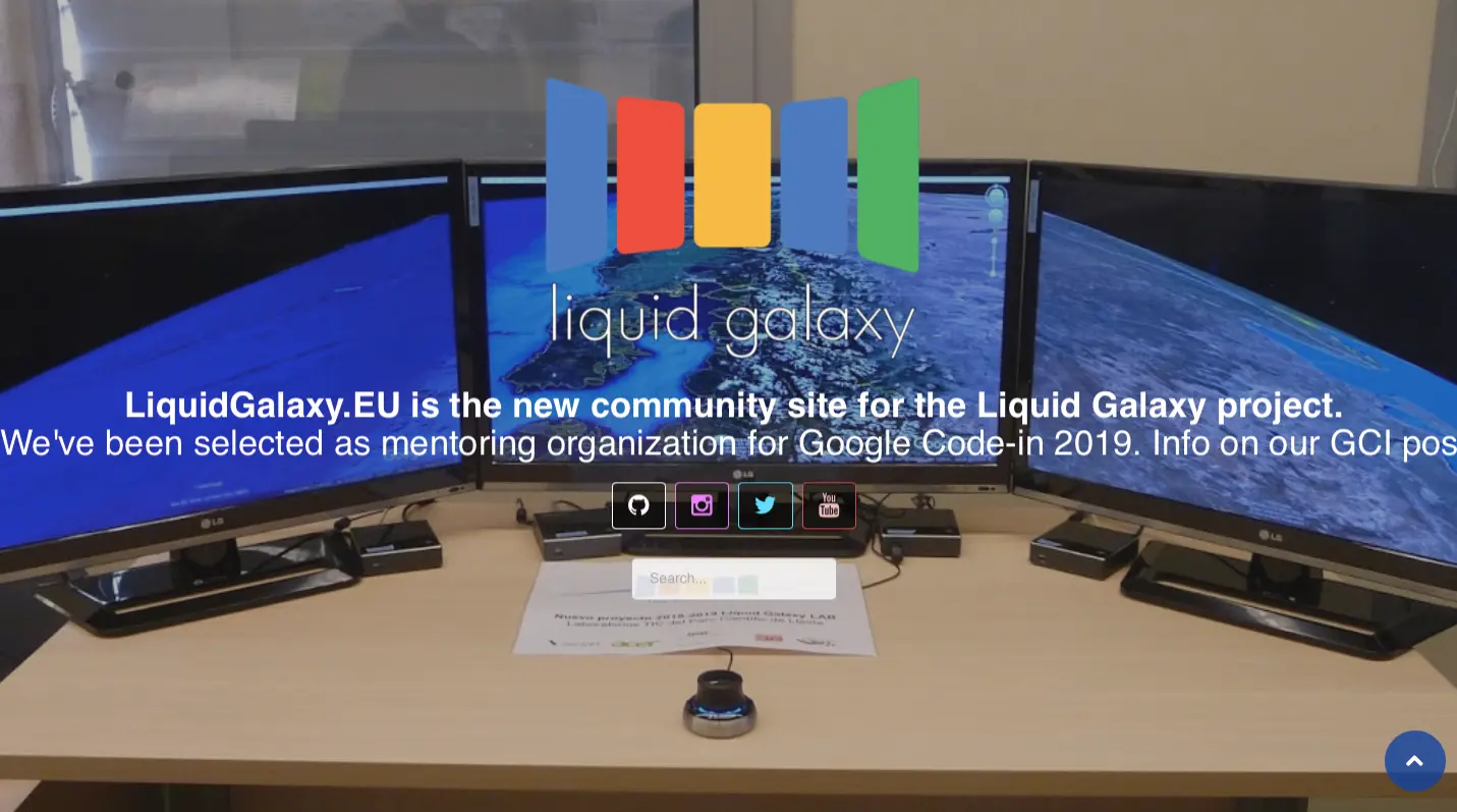
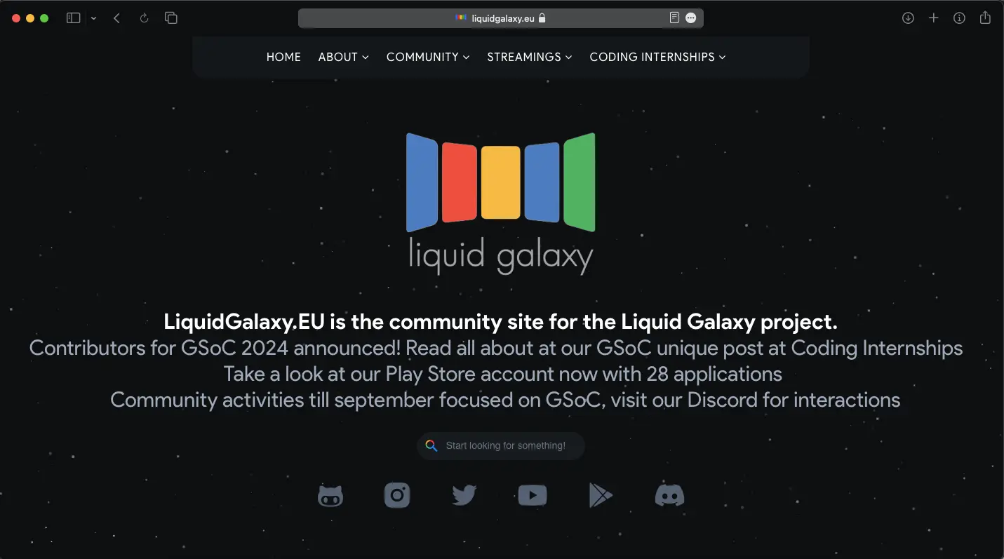
Objective
To create a more user-friendly, responsive design for Liquid Galaxy, ensuring better information architecture and improved user interaction based on established UX principles.
Key UX Principles Applied
- Jacob's Law: Users prefer websites to work in the same way as others they are familiar with.
- Krug's First Law of Usability: "Don't make me think." The design should be intuitive and straightforward.
- Simplicity Principle: Simplified the design to enhance usability and reduce cognitive load.
Design Improvements
- Responsive Design: Ensured the website adapts seamlessly to various devices and screen sizes.
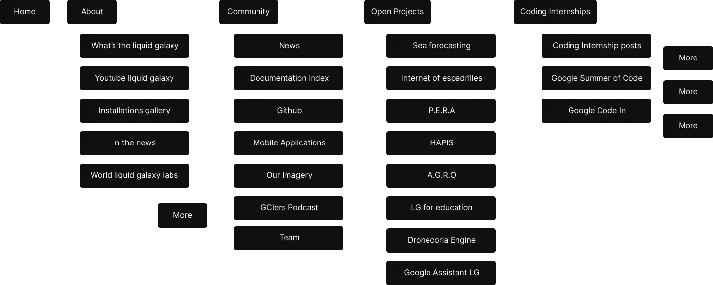
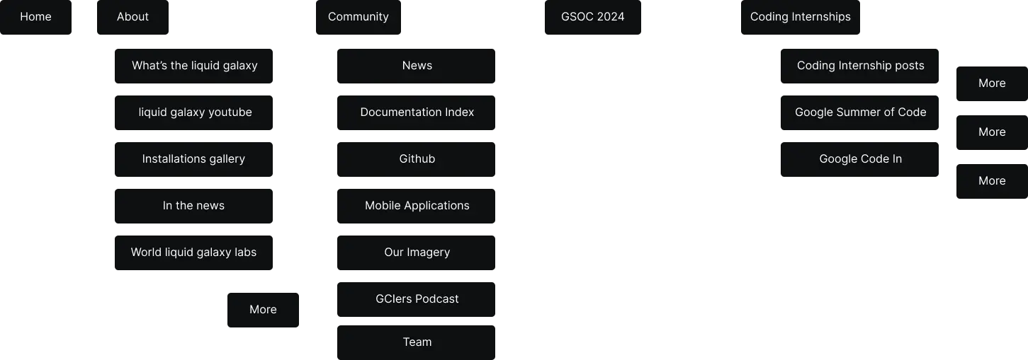
- Information Architecture (IA)
- Simplified navigation structure to help users find information quickly.
- Organized content into clear, logical categories.
-
Visual Design
- Updated the visual hierarchy to guide users' attention to key areas.
- Enhanced readability with better font choices and spacing.
- Interactive Elements
- Added interactive maps and visualizations to engage users.
- Added a Liquid Galaxy wiki for all the important Q and A.
User Satisfaction
- Feedback Scores
- Before Redesign: Average satisfaction score of 7/10.
- After Redesign: Increased to 9/10.
-
Information Accessibility
- Before Redesign: Users took an average of 5 clicks to find key information.
- After Redesign: Reduced to 3 clicks.
Conclusion
The redesign of Liquid Galaxy's website, guided by UX principles and laws, significantly improved user experience and engagement. By making the site more responsive and restructuring the information architecture, users can now navigate the site more intuitively and access information more efficiently.